May 2025
Velto – AI Creative Agency Website
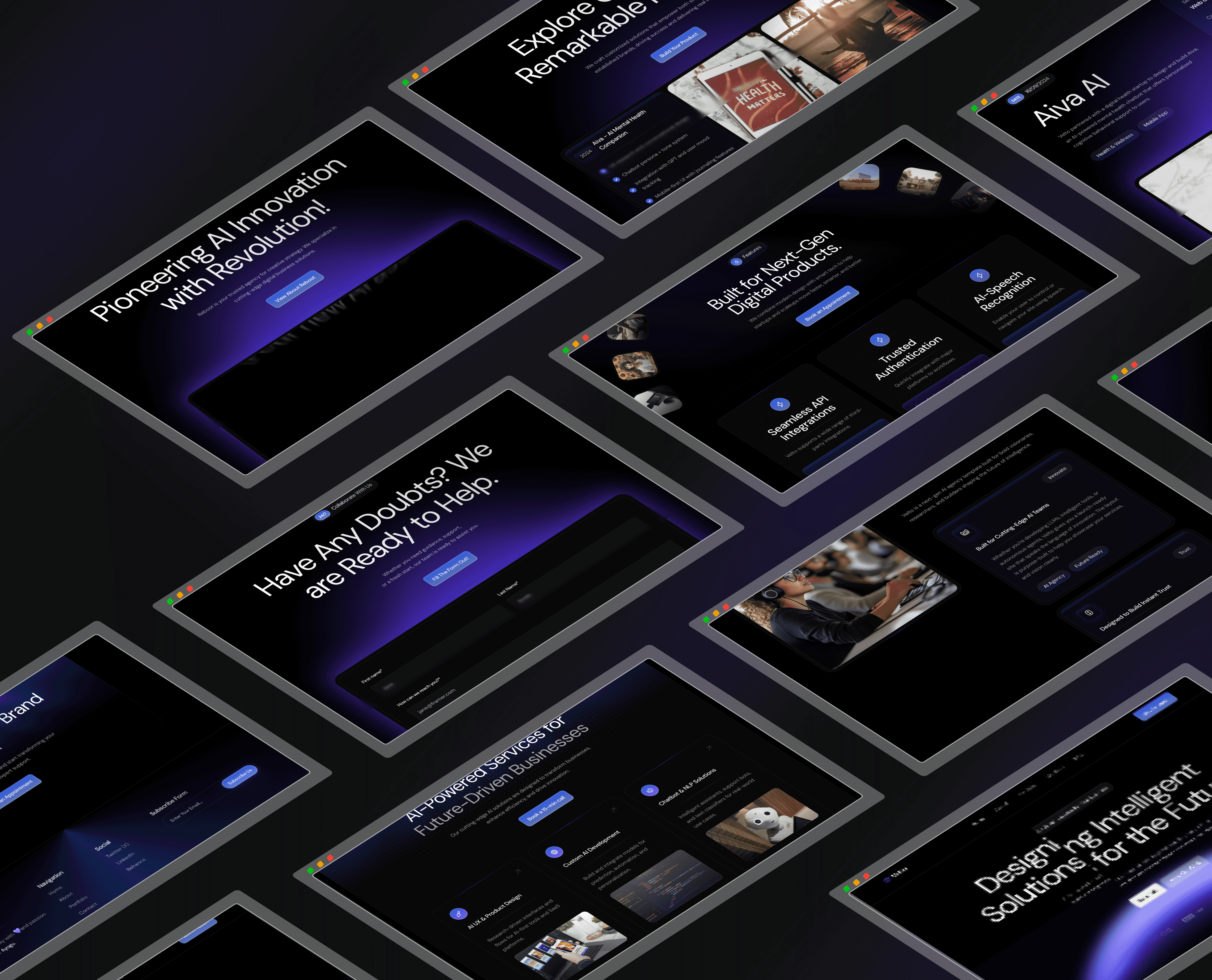
Velto is an AI creative agency targeting startups and forward-thinking brands. They needed more than a website, they needed a digital presence that could convert skeptical founders into paying clients. I led end-to-end design and development: brand identity, UX strategy, copywriting, and a fully responsive Framer build. The result? A high-converting site that positioned Velto as the premium AI partner in their space.
Role
UI/UX Designer, Brand Designer & Framer Developer
The Challenge
The AI agency space is crowded — dozens of companies claiming to be "AI-powered" with websites that all look the same. Velto had no clear visual identity, no conversion strategy, and a previous site that read more like a tech spec sheet than a brand experience. Their bounce rate was high, average session time was low, and inbound leads weren't converting. The core design challenge was threefold: How do you communicate technical depth without alienating non-technical buyers? How do you feel futuristic without feeling cold or generic? And how do you build enough trust in a single scroll to turn a curious visitor into a booked discovery call?
The AI agency space is crowded — dozens of companies claiming to be "AI-powered" with websites that all look the same. Velto had no clear visual identity, no conversion strategy, and a previous site that read more like a tech spec sheet than a brand experience. Their bounce rate was high, average session time was low, and inbound leads weren't converting. The core design challenge was threefold: How do you communicate technical depth without alienating non-technical buyers? How do you feel futuristic without feeling cold or generic? And how do you build enough trust in a single scroll to turn a curious visitor into a booked discovery call?
The Strategic Approach
My first instinct was to open Figma. Instead, I opened a spreadsheet. I audited 12 competing AI agency sites and found the same pattern everywhere — vague hero statements, overloaded service grids, and zero proof of results. Every site said "AI-powered" but none showed what that actually meant for clients. That gap became the strategy.
I reframed the brief entirely: this wasn't a website project, it was a conversion problem. Velto didn't need a prettier site — they needed a sales engine that could earn trust in under 60 seconds.
Three key decisions shaped the entire design:
01 — Content before layout. I wrote every line of copy before sketching a single frame. Each section was structured to answer one unspoken question visitors carry as they scroll: "What do you actually do?" → "Can you prove it?" → "What's the process?" → "How do I start?" This forced the layout to serve the narrative, not the other way around.
02 — Designed for the skeptic, not the fan. Startup founders are pattern-matchers — they've seen dozens of agency pitches. So I borrowed conversion patterns from high-performing SaaS landing pages (social proof placement, progressive disclosure, low-commitment CTAs) and adapted them for an agency context. Every CTA was placed at a natural decision point, not at a random scroll depth.
03 — Dark UI as a strategic differentiator. The dark, editorial direction wasn't an aesthetic preference — it was a positioning move. In a market flooded with light, minimal agency sites, a bold dark interface signals confidence, technical depth, and premium positioning. It also gave us a canvas where Velto's work could speak loudest.
My first instinct was to open Figma. Instead, I opened a spreadsheet. I audited 12 competing AI agency sites and found the same pattern everywhere — vague hero statements, overloaded service grids, and zero proof of results. Every site said "AI-powered" but none showed what that actually meant for clients. That gap became the strategy.
I reframed the brief entirely: this wasn't a website project, it was a conversion problem. Velto didn't need a prettier site — they needed a sales engine that could earn trust in under 60 seconds.
Three key decisions shaped the entire design:
01 — Content before layout. I wrote every line of copy before sketching a single frame. Each section was structured to answer one unspoken question visitors carry as they scroll: "What do you actually do?" → "Can you prove it?" → "What's the process?" → "How do I start?" This forced the layout to serve the narrative, not the other way around.
02 — Designed for the skeptic, not the fan. Startup founders are pattern-matchers — they've seen dozens of agency pitches. So I borrowed conversion patterns from high-performing SaaS landing pages (social proof placement, progressive disclosure, low-commitment CTAs) and adapted them for an agency context. Every CTA was placed at a natural decision point, not at a random scroll depth.
03 — Dark UI as a strategic differentiator. The dark, editorial direction wasn't an aesthetic preference — it was a positioning move. In a market flooded with light, minimal agency sites, a bold dark interface signals confidence, technical depth, and premium positioning. It also gave us a canvas where Velto's work could speak loudest.
My Process
01 — Research & Strategy — Audited 12 competing AI agency websites, identified visual and messaging patterns, defined Velto's differentiators, and mapped ideal client personas (startup founders, brand leads at Series A–B companies).
02 — Content Architecture — Before any visuals, I structured the information hierarchy. Mapped what users need to know, feel, and do at every scroll depth so layout and copy work together as a single conversion engine.
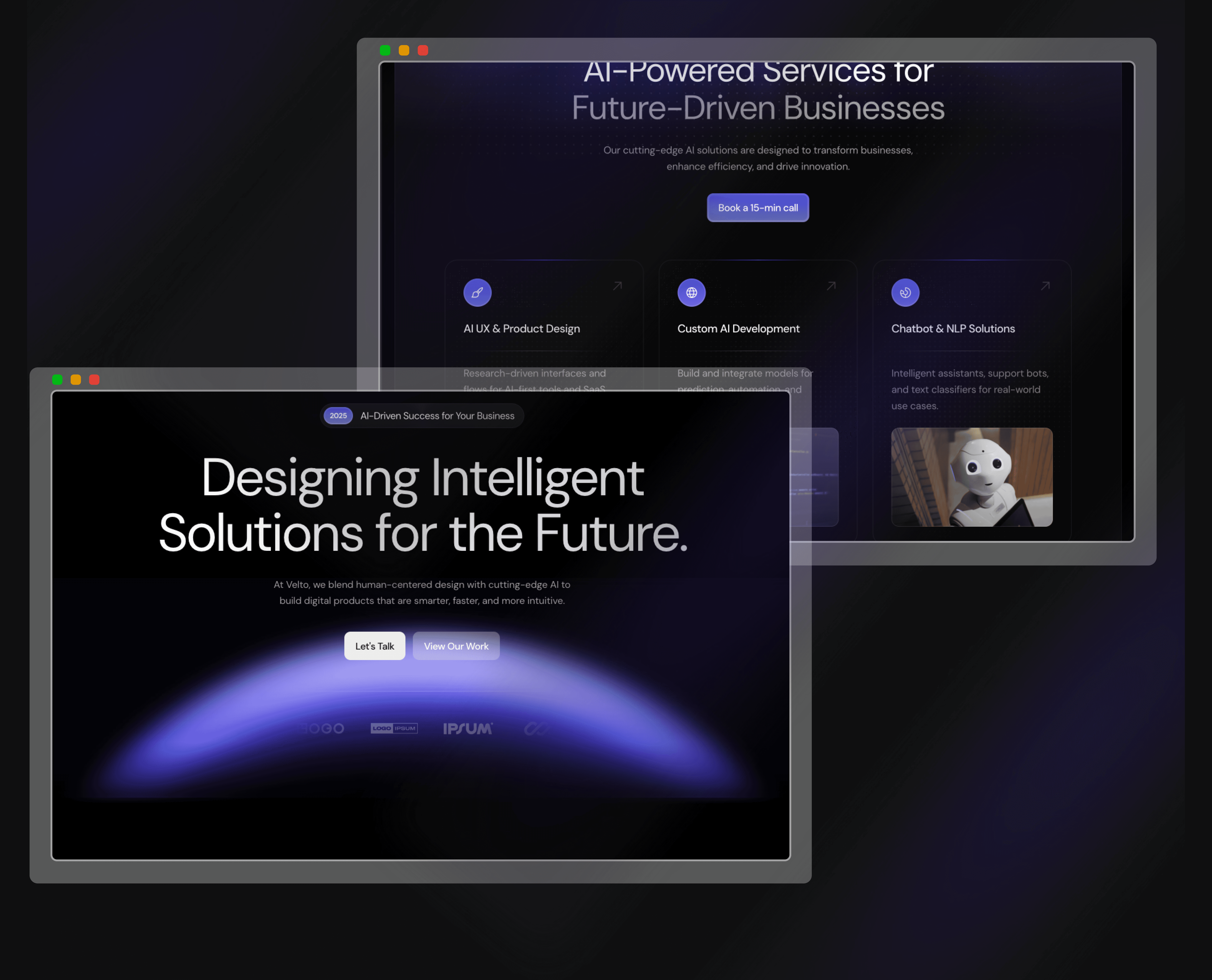
03 — Brand & Visual Design — Developed the full design language from scratch: color system, type scale, spacing grid, icon style, and a reusable component library. The hero section went through 3 iterations to nail the right energy.
04 — Copywriting — Wrote every line of copy myself — sharp headlines, clear service breakdowns, and CTAs that feel like natural next steps, not sales pressure.
05 — Framer Development — Built and shipped in Framer with responsive breakpoints across desktop, tablet, and mobile. Added scroll-triggered animations, hover micro-interactions, and CMS-ready architecture for future content updates.
01 — Research & Strategy — Audited 12 competing AI agency websites, identified visual and messaging patterns, defined Velto's differentiators, and mapped ideal client personas (startup founders, brand leads at Series A–B companies).
02 — Content Architecture — Before any visuals, I structured the information hierarchy. Mapped what users need to know, feel, and do at every scroll depth so layout and copy work together as a single conversion engine.
03 — Brand & Visual Design — Developed the full design language from scratch: color system, type scale, spacing grid, icon style, and a reusable component library. The hero section went through 3 iterations to nail the right energy.
04 — Copywriting — Wrote every line of copy myself — sharp headlines, clear service breakdowns, and CTAs that feel like natural next steps, not sales pressure.
05 — Framer Development — Built and shipped in Framer with responsive breakpoints across desktop, tablet, and mobile. Added scroll-triggered animations, hover micro-interactions, and CMS-ready architecture for future content updates.
The Design
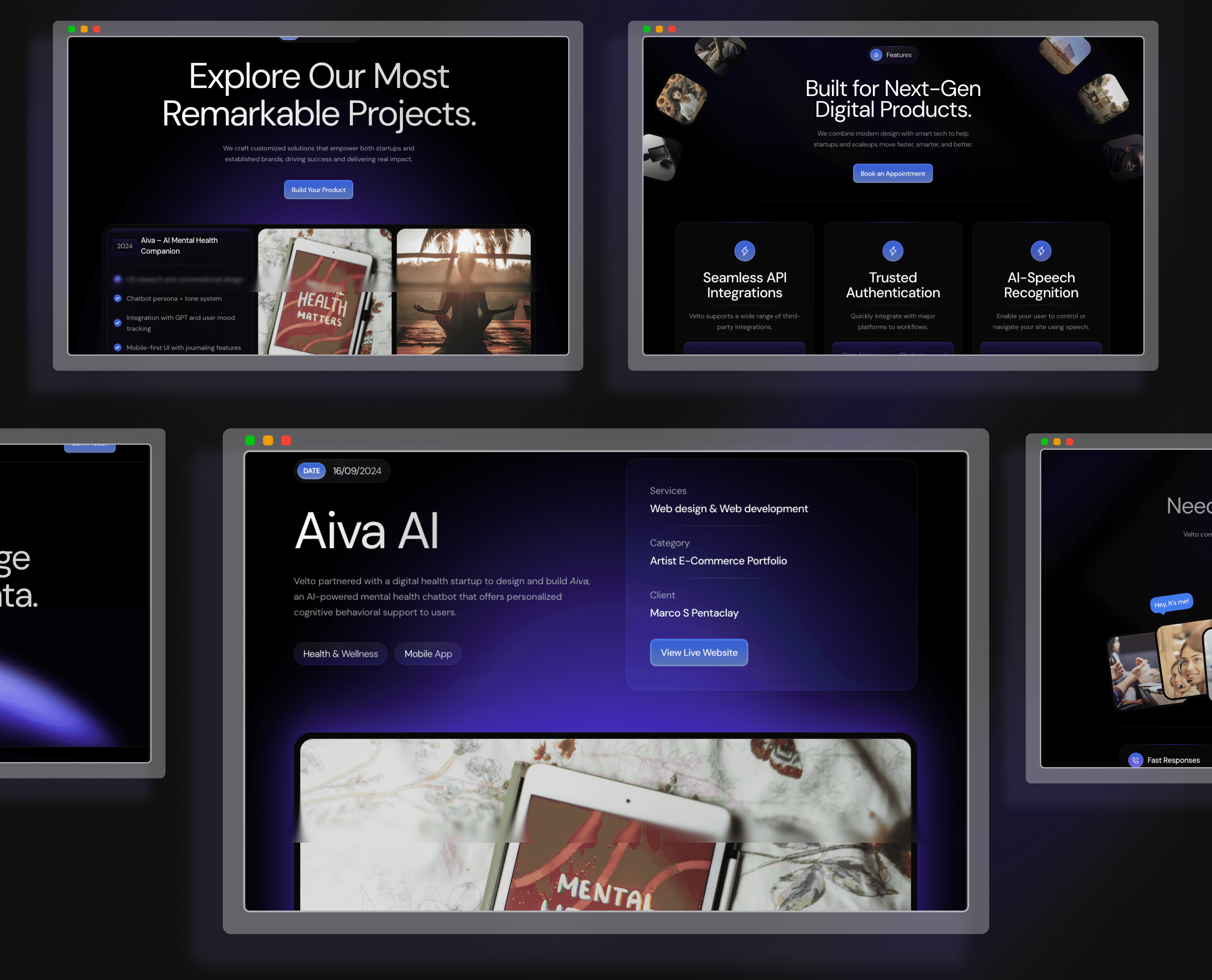
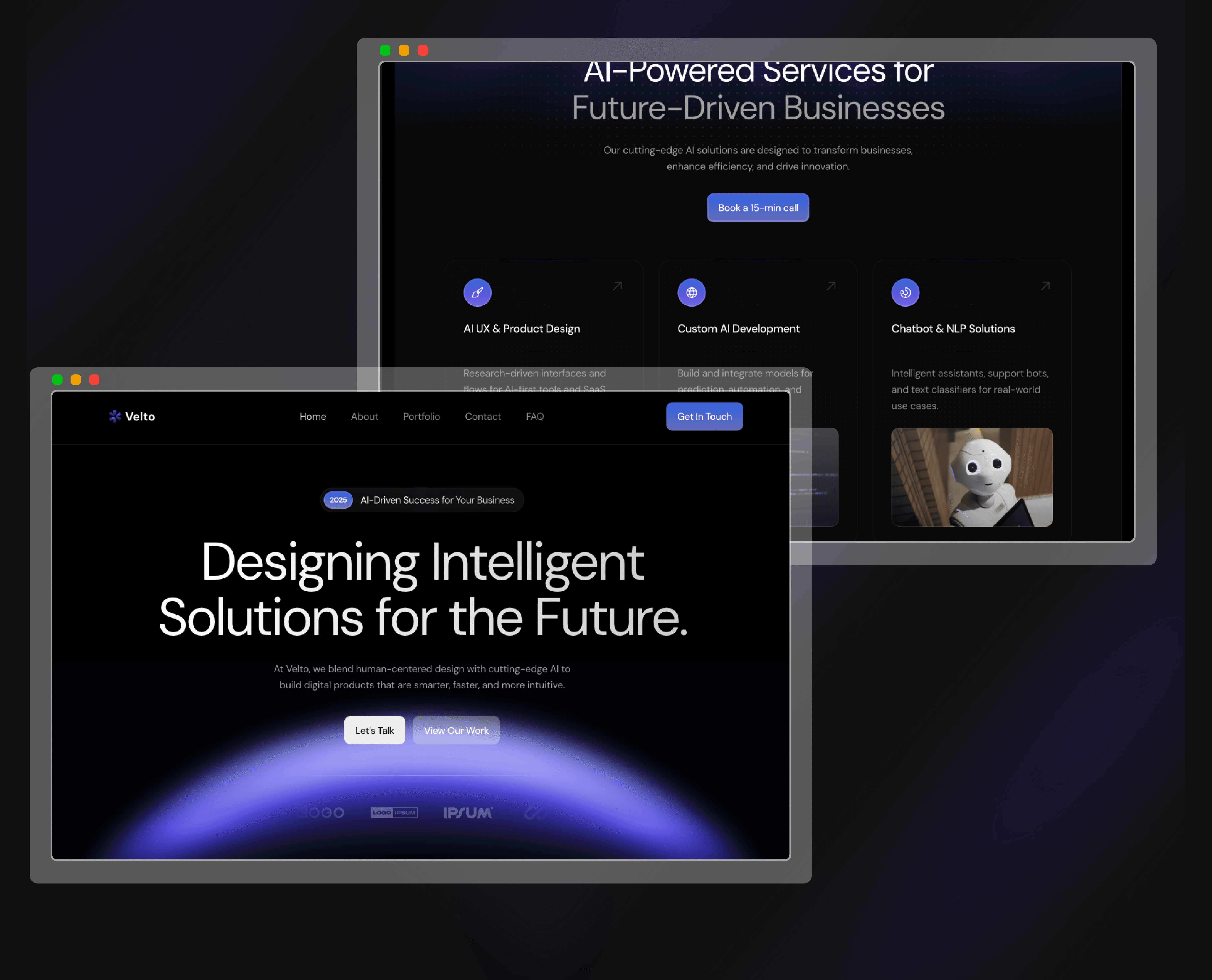
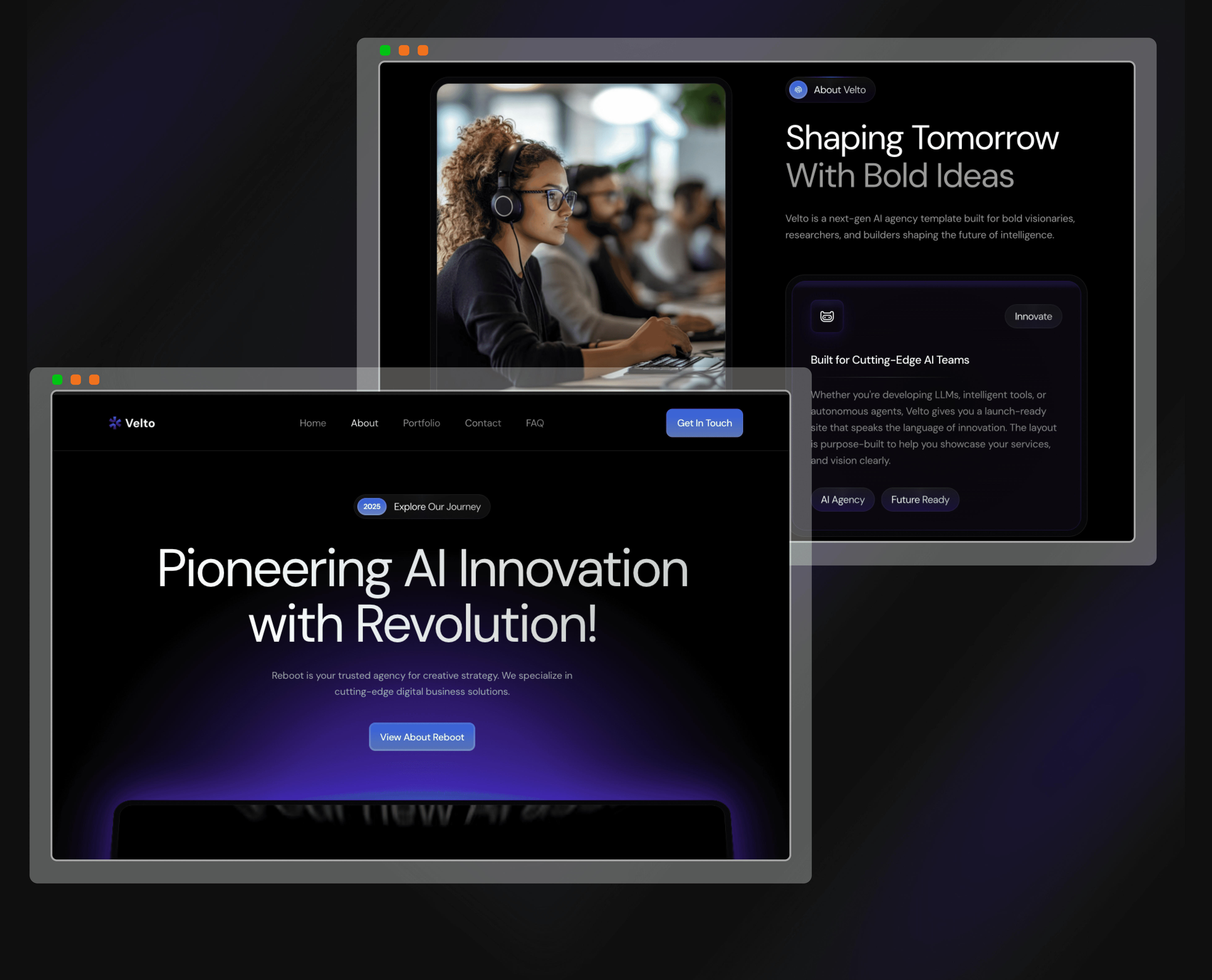
Velto Home Page
Velto About Page
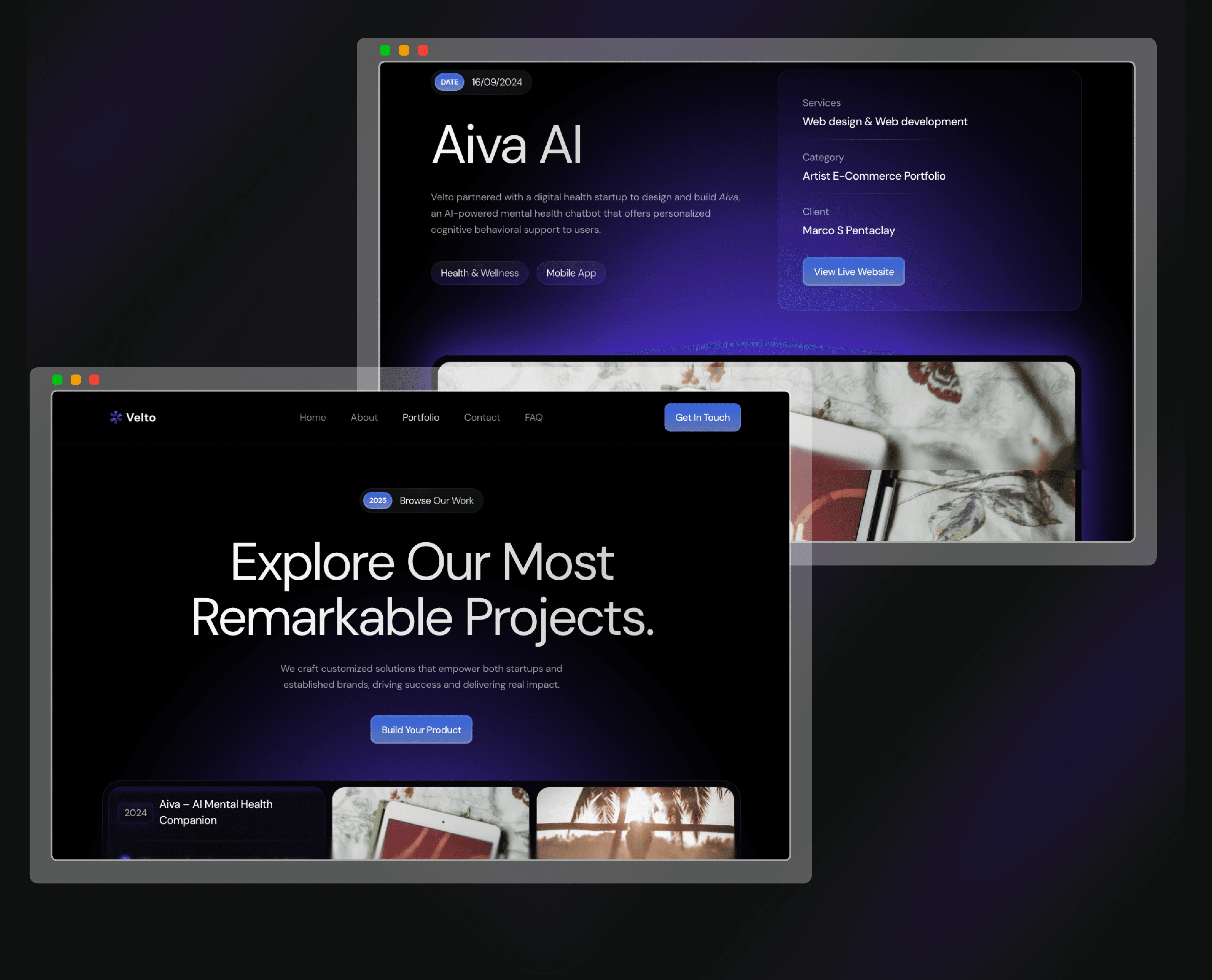
Velto Portfolio Page
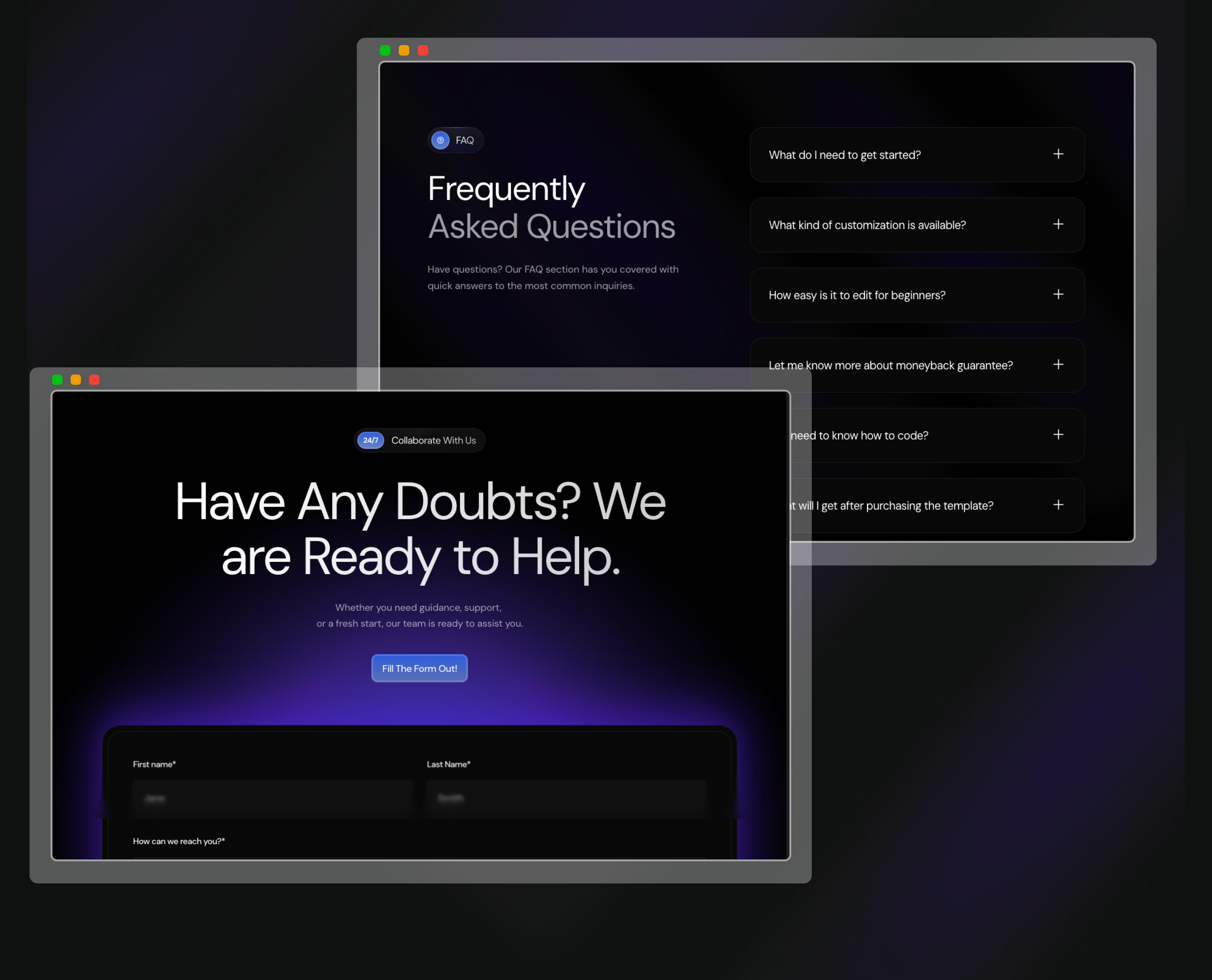
Velto Contact Page
Outcome
-42%
Bounce Rate Reduction
3.2x
Avg. Session Duration
+67%
Lead Conversion Rate
5
Responsive Pages Shipped
Velto launched with a site that didn't just look good — it performed. Within the first 30 days post-launch, the numbers told a clear story: visitors were staying longer, engaging deeper, and converting at a significantly higher rate. Beyond metrics, Velto now has a scalable design system, a brand identity that commands premium positioning, and a digital home that earns trust before a single word is spoken. The client has since received inbound interest from two Series A startups directly citing the website as the reason they reached out.
Velto launched with a site that didn't just look good — it performed. Within the first 30 days post-launch, the numbers told a clear story: visitors were staying longer, engaging deeper, and converting at a significantly higher rate. Beyond metrics, Velto now has a scalable design system, a brand identity that commands premium positioning, and a digital home that earns trust before a single word is spoken. The client has since received inbound interest from two Series A startups directly citing the website as the reason they reached out.
Recent Designs



Reach out:
© Copyright 2025
Reach out:
© Copyright 2025
Reach out:
© Copyright 2025