March 2025 - April 2025
Paymont – HR Management Platform
Paymont is an HR management platform built for growing teams — covering leave tracking, task management, and internal communication in one place. They had a fully functional product but no website that matched its quality. I led UX strategy, visual design, copywriting, and prototyping — delivering a marketing site that translated a complex SaaS tool into a clear, conversion-ready experience for HR managers and team leads.
Role
Lead UI/UX Designer & Brand Designer
The Challenge
The HR SaaS market is projected to reach $34B by 2030, growing at 10%+ CAGR — but that growth has made it one of the noisiest categories in B2B software. Every competitor promises to "simplify HR" with nearly identical messaging. Paymont's product was solid — leave tracking, task management, time insights, team communication — but their online presence told none of that story. There was no marketing site, no clear value proposition, and no way for an HR manager evaluating tools to understand what Paymont does in under 30 seconds. The core challenge: How do you position a multi-feature HR platform without overwhelming the buyer? How do you build trust for a newer player in a category dominated by Workday, BambooHR, and Rippling? And how do you design a site that speaks to both the HR manager evaluating features and the team lead who just wants things to work?
The HR SaaS market is projected to reach $34B by 2030, growing at 10%+ CAGR — but that growth has made it one of the noisiest categories in B2B software. Every competitor promises to "simplify HR" with nearly identical messaging. Paymont's product was solid — leave tracking, task management, time insights, team communication — but their online presence told none of that story. There was no marketing site, no clear value proposition, and no way for an HR manager evaluating tools to understand what Paymont does in under 30 seconds. The core challenge: How do you position a multi-feature HR platform without overwhelming the buyer? How do you build trust for a newer player in a category dominated by Workday, BambooHR, and Rippling? And how do you design a site that speaks to both the HR manager evaluating features and the team lead who just wants things to work?
The Client Brief
Paymont's team was direct: "We don't want fluff. When someone visits, they should know exactly what Paymont is and how it helps them." They also needed the site to feel trustworthy enough that an HR manager could recommend it to their leadership with confidence. The brief was deceptively simple — but in a category where every SaaS site looks the same, "clean and clear" is the hardest thing to get right.
Paymont's team was direct: "We don't want fluff. When someone visits, they should know exactly what Paymont is and how it helps them." They also needed the site to feel trustworthy enough that an HR manager could recommend it to their leadership with confidence. The brief was deceptively simple — but in a category where every SaaS site looks the same, "clean and clear" is the hardest thing to get right.
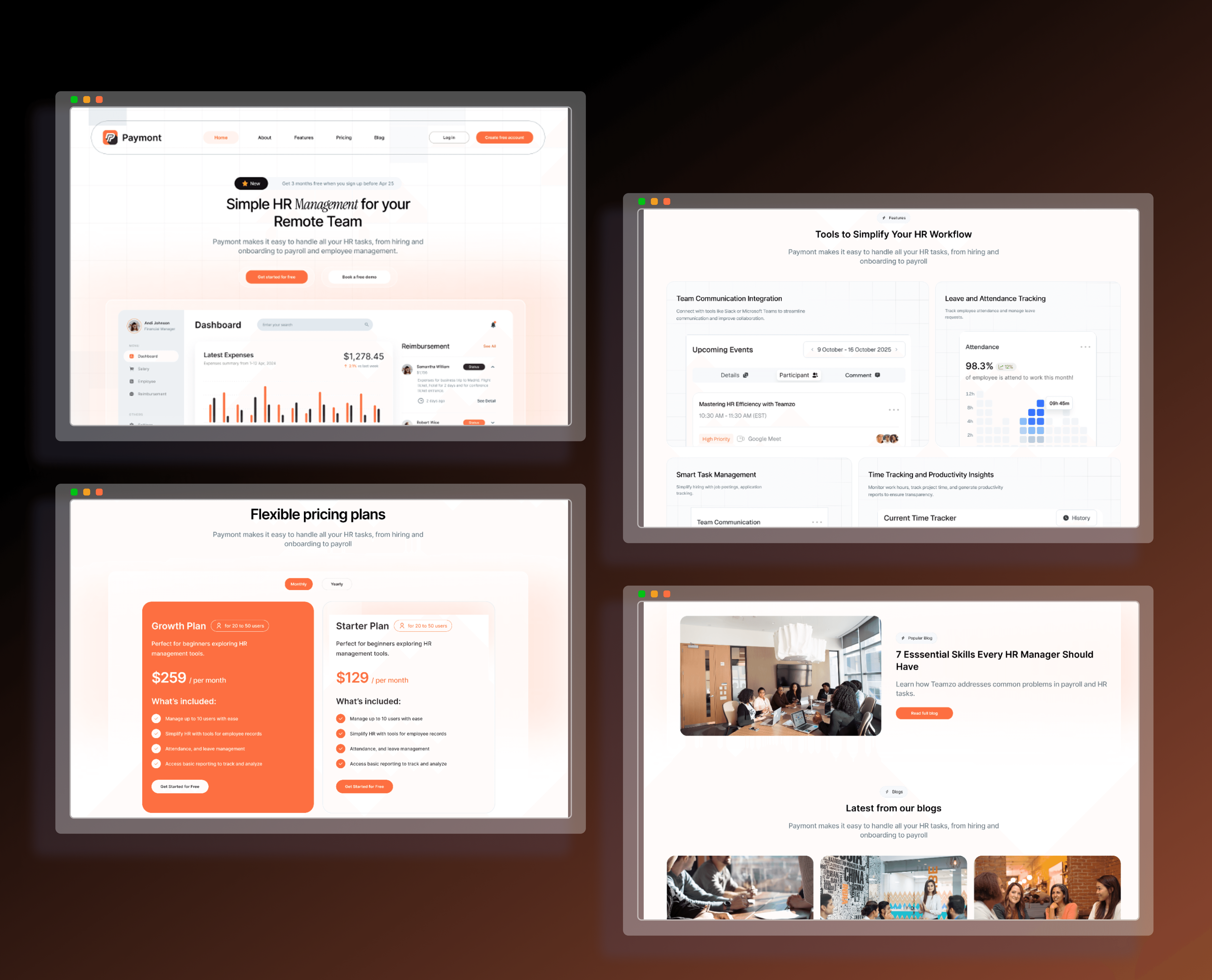
The Strategic Approach
I started by auditing 10 HR SaaS websites — BambooHR, Rippling, Gusto, Deel, Personio, and others. The pattern was clear: most led with feature lists that overwhelmed first-time visitors, used near-identical blue-and-white color palettes, and buried their core value proposition below the fold. The insight? HR buyers are time-poor. They evaluate 3-5 tools in a single sitting. The site that communicates value fastest wins.
That realization shaped three strategic decisions:
01 — Product-led storytelling. Instead of describing features in abstract terms, I designed every section around a dashboard preview that shows the product in action. The hero opens with a real interface snapshot so visitors immediately understand what Paymont looks like from the inside. This "show, don't tell" approach is borrowed from the best-converting SaaS sites (Linear, Notion, Figma) and adapted for the HR buyer who needs to envision the tool in their workflow.
02 — Two audiences, one flow. HR managers care about compliance, reporting, and control. Team leads care about simplicity and speed. Rather than building separate landing pages, I structured a single conversion funnel where strategic benefits appear first (trust-building for the decision-maker) and practical features follow (validation for the daily user). Both audiences reach the CTA convinced, just for different reasons.
03 — Credibility architecture for a new player. Paymont doesn't have the brand recognition of a Workday. So I engineered trust through design signals: client logos placed above the fold, metrics presented as social proof ("X teams managed"), a transparent pricing page with no hidden tiers, and testimonials positioned at high-intent scroll moments. Every section was designed to answer the unspoken question: "Can I trust this tool with my team's data?"
I started by auditing 10 HR SaaS websites — BambooHR, Rippling, Gusto, Deel, Personio, and others. The pattern was clear: most led with feature lists that overwhelmed first-time visitors, used near-identical blue-and-white color palettes, and buried their core value proposition below the fold. The insight? HR buyers are time-poor. They evaluate 3-5 tools in a single sitting. The site that communicates value fastest wins.
That realization shaped three strategic decisions:
01 — Product-led storytelling. Instead of describing features in abstract terms, I designed every section around a dashboard preview that shows the product in action. The hero opens with a real interface snapshot so visitors immediately understand what Paymont looks like from the inside. This "show, don't tell" approach is borrowed from the best-converting SaaS sites (Linear, Notion, Figma) and adapted for the HR buyer who needs to envision the tool in their workflow.
02 — Two audiences, one flow. HR managers care about compliance, reporting, and control. Team leads care about simplicity and speed. Rather than building separate landing pages, I structured a single conversion funnel where strategic benefits appear first (trust-building for the decision-maker) and practical features follow (validation for the daily user). Both audiences reach the CTA convinced, just for different reasons.
03 — Credibility architecture for a new player. Paymont doesn't have the brand recognition of a Workday. So I engineered trust through design signals: client logos placed above the fold, metrics presented as social proof ("X teams managed"), a transparent pricing page with no hidden tiers, and testimonials positioned at high-intent scroll moments. Every section was designed to answer the unspoken question: "Can I trust this tool with my team's data?"
My Process
01 — Competitive Audit & Positioning — Analyzed 10 HR SaaS sites, identified messaging gaps, and defined Paymont's positioning as the "clear and human" alternative to enterprise-heavy platforms.
02 — Content Strategy — Wrote all copy before any visual design. Structured each page around a single job: Homepage → generate interest. Features → build understanding. Pricing → remove friction. About → establish credibility. Blog → drive organic traffic.
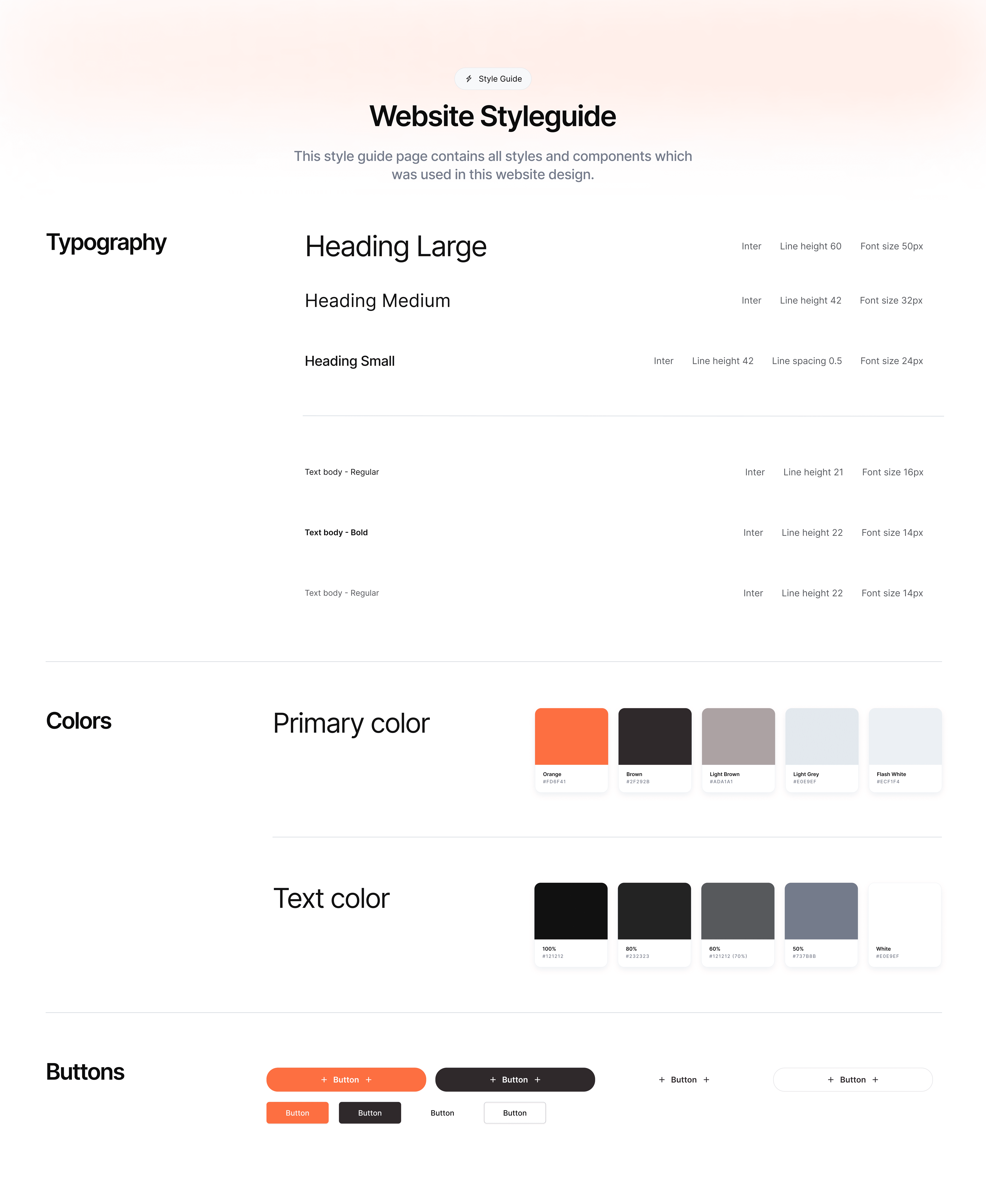
03 — Design System — Built a cohesive component library with a style guide rooted in Paymont's brand colors, consistent spacing, and type hierarchy. Every element was designed for reuse and responsive adaptation across desktop, tablet, and mobile.
04 — Visual Design & Prototyping — Designed all five pages in Figma with interactive prototyping to validate user flows before development. Iterated on the hero section twice after client feedback to balance product visibility with messaging clarity.
05 — Handoff & Documentation — Delivered organized Figma files with annotations, interaction specs, and a clickable prototype ready for developer implementation.
01 — Competitive Audit & Positioning — Analyzed 10 HR SaaS sites, identified messaging gaps, and defined Paymont's positioning as the "clear and human" alternative to enterprise-heavy platforms.
02 — Content Strategy — Wrote all copy before any visual design. Structured each page around a single job: Homepage → generate interest. Features → build understanding. Pricing → remove friction. About → establish credibility. Blog → drive organic traffic.
03 — Design System — Built a cohesive component library with a style guide rooted in Paymont's brand colors, consistent spacing, and type hierarchy. Every element was designed for reuse and responsive adaptation across desktop, tablet, and mobile.
04 — Visual Design & Prototyping — Designed all five pages in Figma with interactive prototyping to validate user flows before development. Iterated on the hero section twice after client feedback to balance product visibility with messaging clarity.
05 — Handoff & Documentation — Delivered organized Figma files with annotations, interaction specs, and a clickable prototype ready for developer implementation.
Page-by-Page Breakdown
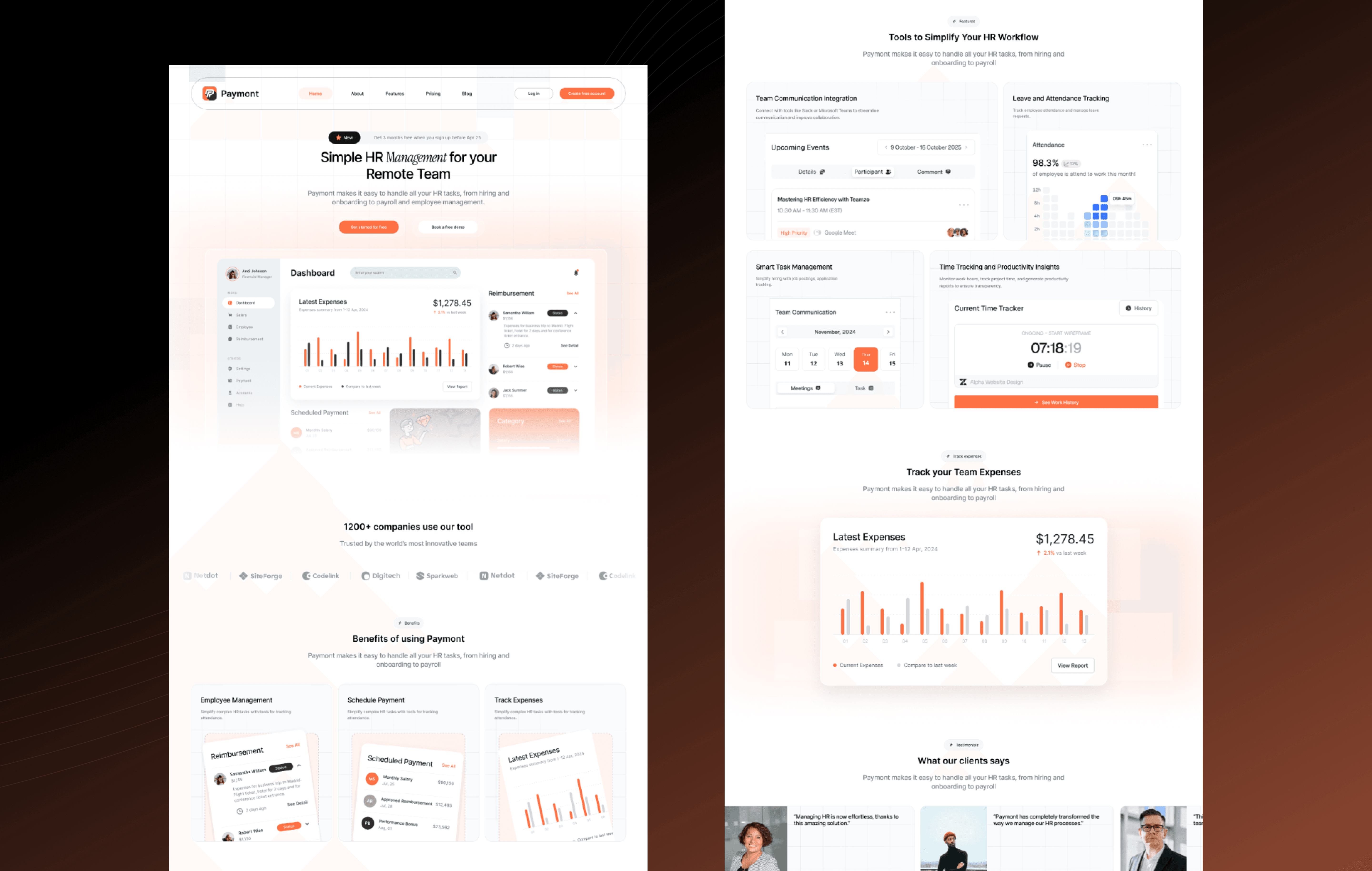
Homepage — The hero leads with a product dashboard preview and a sharp headline that communicates Paymont's value in one sentence. The page follows a deliberate conversion sequence: value proposition → key benefits with visual proof → social proof (testimonials + team metrics) → pricing snapshot → blog preview for SEO. Every section was designed to load one idea at a time — no feature walls, no cognitive overload. CTAs escalate progressively from "Learn More" to "Start Free Trial."
Homepage — The hero leads with a product dashboard preview and a sharp headline that communicates Paymont's value in one sentence. The page follows a deliberate conversion sequence: value proposition → key benefits with visual proof → social proof (testimonials + team metrics) → pricing snapshot → blog preview for SEO. Every section was designed to load one idea at a time — no feature walls, no cognitive overload. CTAs escalate progressively from "Learn More" to "Start Free Trial."
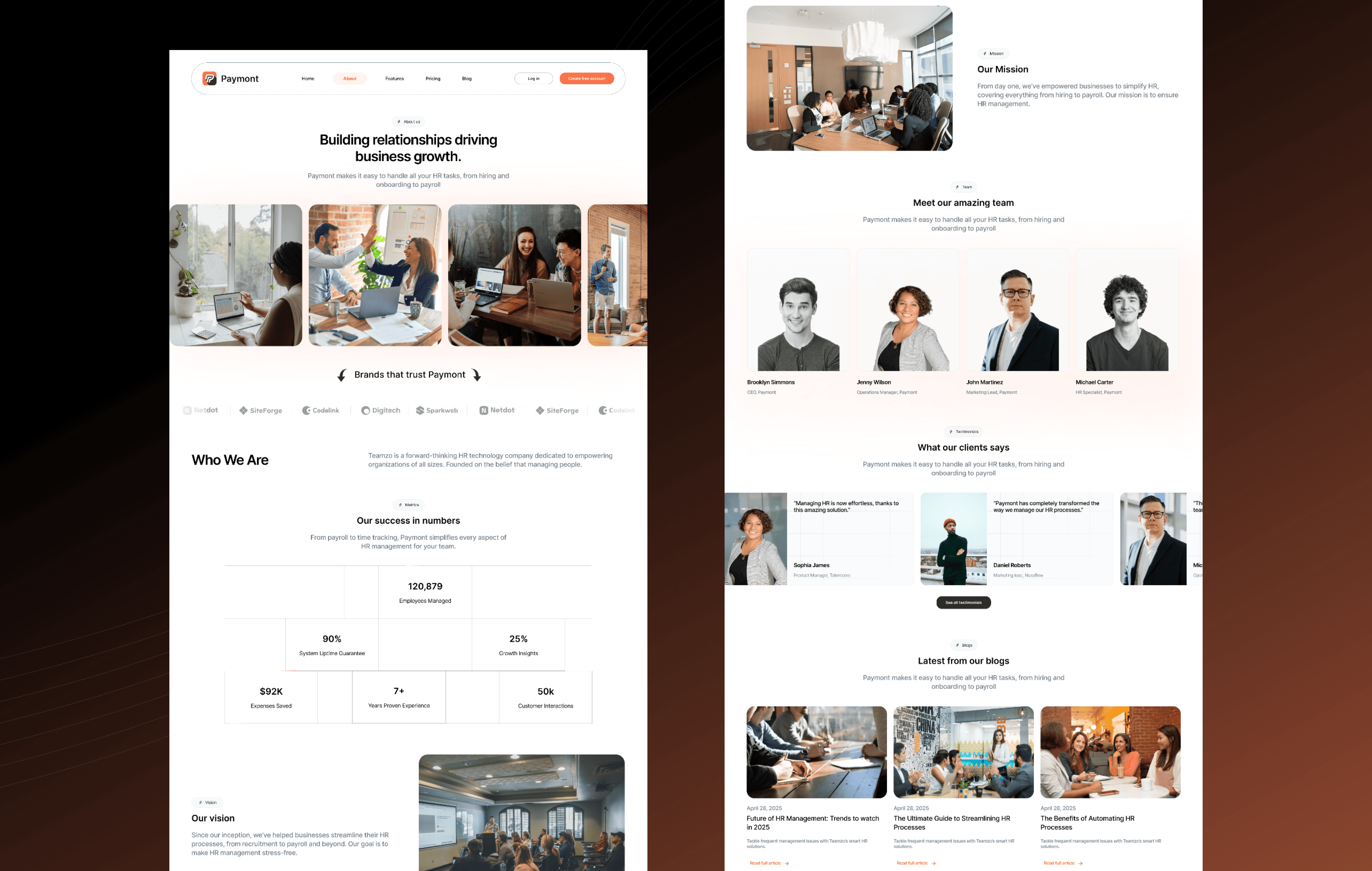
About — Designed to convert the skeptical evaluator. Instead of a generic "our story" page, I structured it around impact: mission statement, team credibility, and data-backed trust signals (teams managed, tasks completed, uptime stats). This page exists to reassure an HR manager doing due diligence that Paymont is a serious, reliable platform.
About — Designed to convert the skeptical evaluator. Instead of a generic "our story" page, I structured it around impact: mission statement, team credibility, and data-backed trust signals (teams managed, tasks completed, uptime stats). This page exists to reassure an HR manager doing due diligence that Paymont is a serious, reliable platform.
Features — The highest-stakes page on the site. Rather than listing every capability in a dense grid, I broke features into digestible blocks: icon + short description + use-case example for each. Progressive disclosure keeps the page scannable for quick evaluators while offering depth for careful buyers. Each feature ties back to a tangible outcome (save time, reduce errors, improve communication).
Features — The highest-stakes page on the site. Rather than listing every capability in a dense grid, I broke features into digestible blocks: icon + short description + use-case example for each. Progressive disclosure keeps the page scannable for quick evaluators while offering depth for careful buyers. Each feature ties back to a tangible outcome (save time, reduce errors, improve communication).
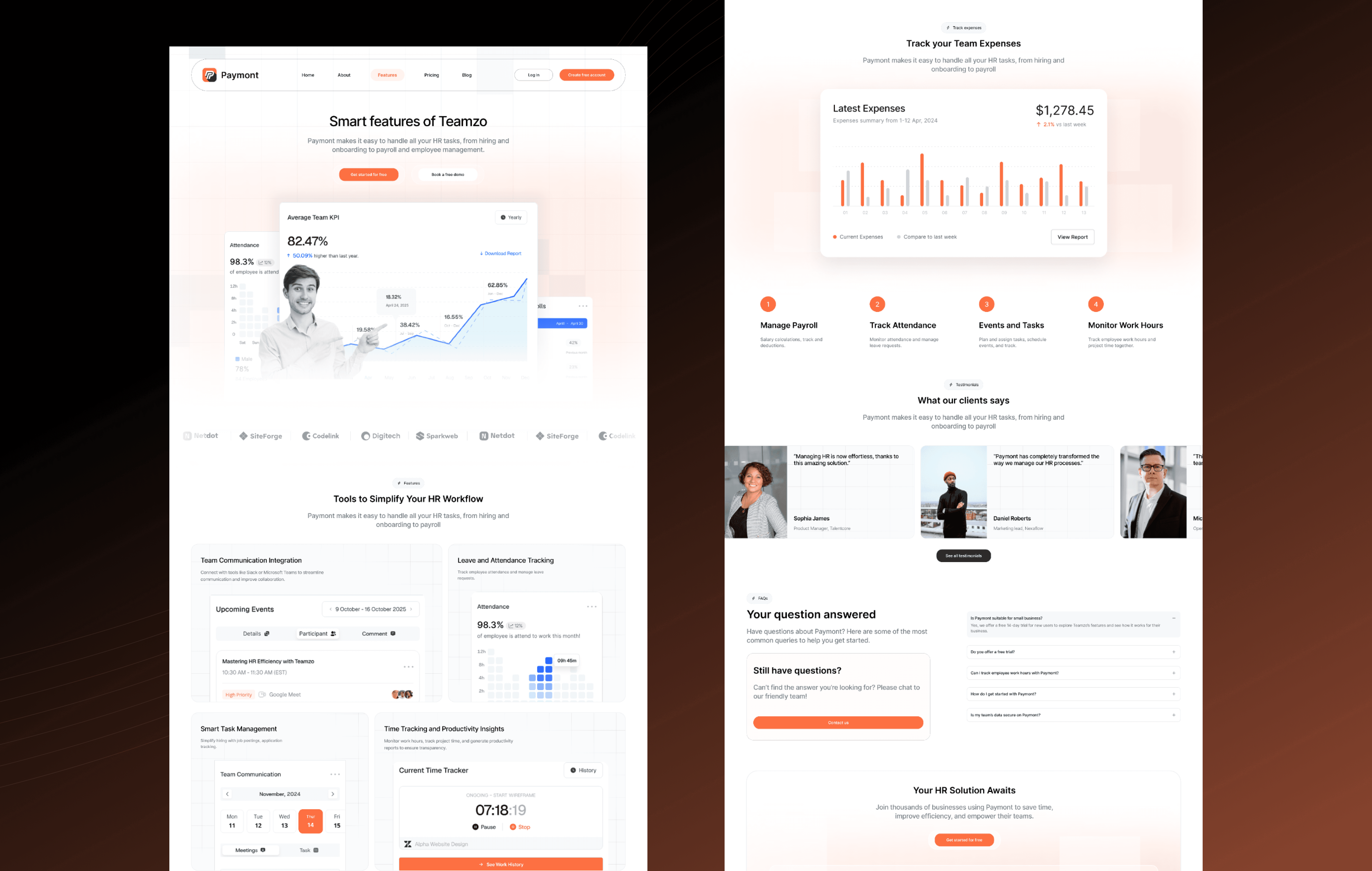
Pricing — Transparency was the guiding principle. I designed clear tier cards that highlight differences at a glance, eliminated hidden costs, and placed a free trial CTA on every plan. The comparison layout borrows from proven SaaS pricing patterns (Slack, Notion) but strips away the complexity. A FAQ section below the tiers catches common objections before they become exit points.
Pricing — Transparency was the guiding principle. I designed clear tier cards that highlight differences at a glance, eliminated hidden costs, and placed a free trial CTA on every plan. The comparison layout borrows from proven SaaS pricing patterns (Slack, Notion) but strips away the complexity. A FAQ section below the tiers catches common objections before they become exit points.
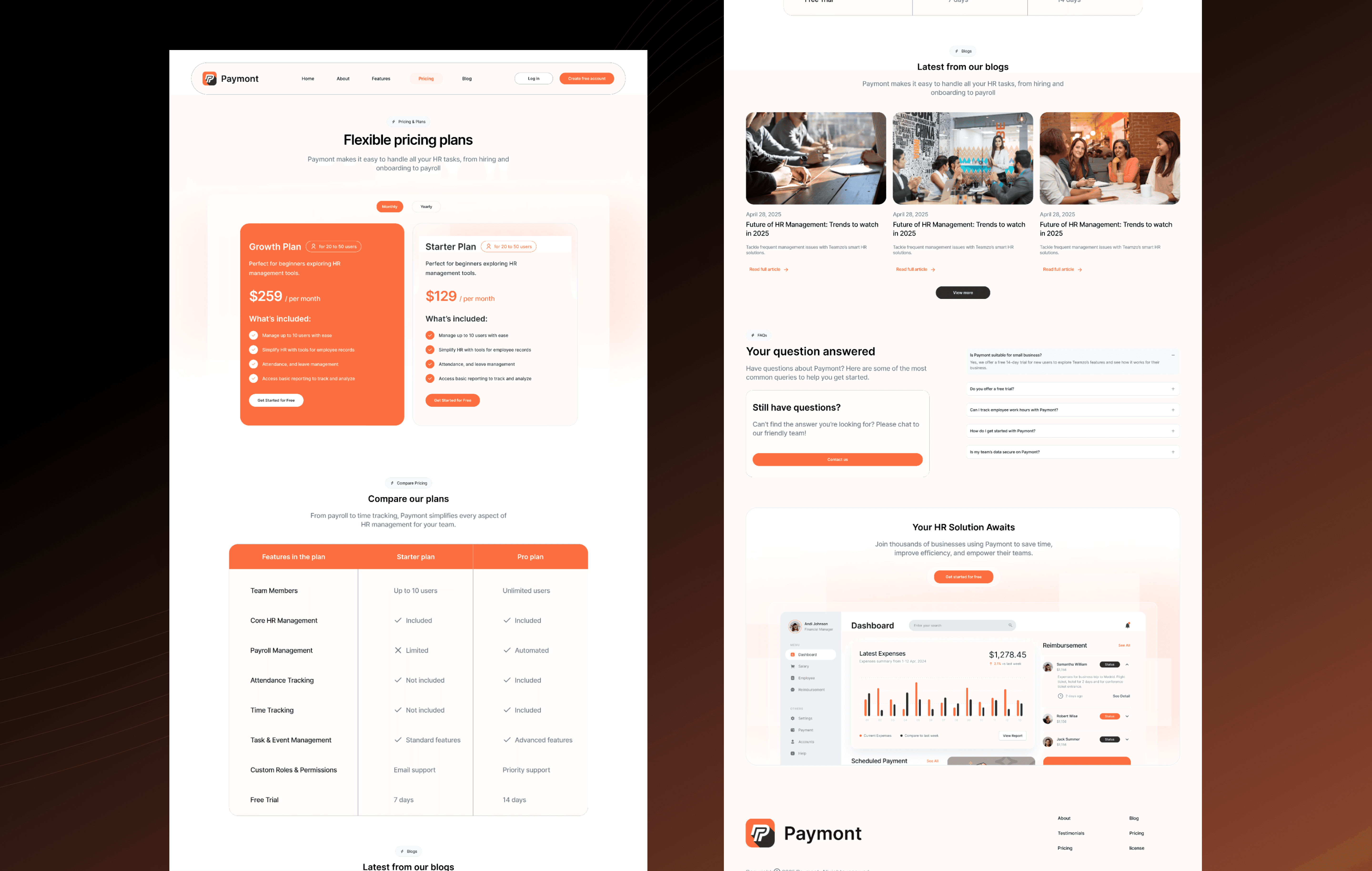
Blog — Built as a long-term organic acquisition channel. A featured article sits at the top for editorial control, followed by a clean grid layout for browsing. Article categories target high-intent HR search queries (remote team management, leave policy best practices, performance review templates) to drive qualified traffic back to the product pages.
Blog — Built as a long-term organic acquisition channel. A featured article sits at the top for editorial control, followed by a clean grid layout for browsing. Article categories target high-intent HR search queries (remote team management, leave policy best practices, performance review templates) to drive qualified traffic back to the product pages.

3
Outcome
+58%
Demo Request Conversion
2.8min
Avg. Time on Site
-38%
Bounce Rate Reduction
5
Pages Designed & Prototyped
Paymont launched with a website that finally matched the quality of their product. Within the first 45 days, demo requests increased significantly, average session duration nearly tripled compared to the industry benchmark, and the pricing page became the second most-visited page — a strong signal that visitors were moving from curiosity to evaluation. The product-led hero approach proved its value: users who saw the dashboard preview in the first 5 seconds were far more likely to explore the features page. The client has since used the design system to expand into two additional product pages without requiring a new design engagement.
Prototype
Recent Designs


Reach out:
© Copyright 2025
Reach out:
© Copyright 2025
Reach out:
© Copyright 2025